
Responsive Websites For All Devices
desktop | tablet | mobile
Flexible & Future Proof From The Ground Up
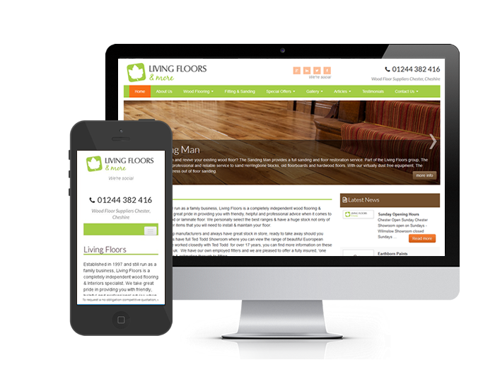
Responsive website design gives a website the ability to dynamically re-size and re-order content for a number of difference screen sizes. Websites these days are viewed with a multitude of different devices from mobile phones & tablets to widescreen desktop monitors.
To take these changes into account responsive website frameworks have been developed. These responsive frameworks alter the website to fit the screen size of the device the website is being viewed on. Responsive website design also takes into account future developments and new screen sizes of future devices.
Read more about our aesthetically pleasing website design

Stay Up To Date
Older websites do not use responsive technology and are harder to view on smaller devices, in effect cutting down user experience for potentially a high percentage of visitors.
All our websites are built with responsive technology to help improve viewer experience on current and future devices.
The future is responsive, one website looking great, responding to any current or future device.
Read more about our aesthetically pleasing website design
Some of Our Clients


